In agents are users too: stress-testing AI products with synthetic users we tested what an AI product says. Made-up people talked to it, and separate judges scored the transcripts against the logs. It worked, and it left a gap we kept walking past.
Every one of those tests asked for an opinion. A judge reads something and gives it a score. But a lot of what an AI makes now isn't read by a judge. It's a screen, a page, a one-pager, built in a chat by one person and then sent to someone who wasn't in that chat. A sponsor opens it between meetings. A team member opens it to find their part. A manager opens it to update a date. None of them is reviewing it. They're trying to get something out of it.
So this time we didn't ask anyone what they thought. We gave synthetic readers a role, a task and a browser, and watched what they did.
the question
Can vision-driven agents, each playing a different reader, find the usability problems in a screen an AI made, just by trying to use it?
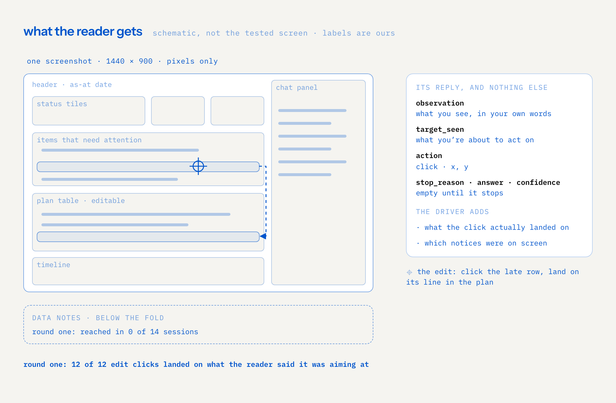
The screen was a real one: an internal planning tool an AI produced inside a larger company we work with. We tested its 100-day plan screen, the kind of page that's meant to carry a meeting. A status summary at the top, a list of items that need attention, an editable plan table, a timeline, a chat panel on the side. It had already passed the other kind of test: it looked right, and it kept real data out. Nobody had yet checked whether a person who wasn't there when it was made could use it.
the hypotheses
We wrote down four before the first run, so the report could say supported or not instead of "interesting":
| # | hypothesis | what would count as evidence |
|---|---|---|
| 1 | Agents can operate the screen through screenshots alone | Sessions end in a grounded answer; clicks land where the reader meant |
| 2 | Friction shows up without asking for critique | Problems tied to a step and a screenshot, in the readers' own task answers |
| 3 | Different readers behave differently on the same screen | Different paths, different stops, different readings |
| 4 | Readers can tell what on the page is real and what is illustrative | Correct answers to a trust task, and whether the page's data notes are ever seen |
The fourth is the one we cared about most. The system that produced the screen puts its whole data story (which dates are assumed, which names are made up) in small muted notes at the foot of the page. We wanted to know if anyone in a hurry ever reads them.
the setup
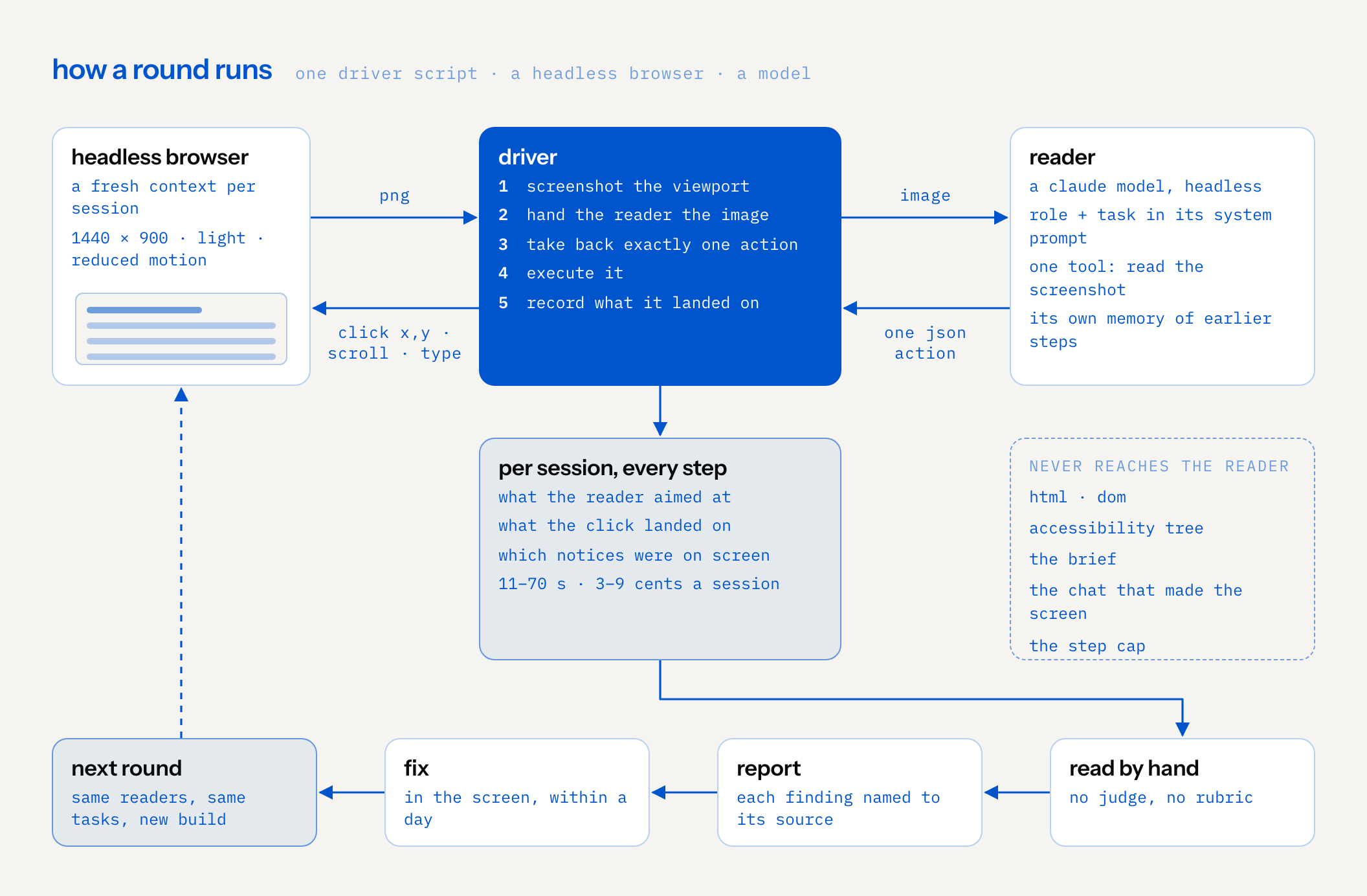
The lab is deliberately small: one driver script, a headless browser and a model. No dashboard, no harness on top.
- The browser. Headless Chromium through Playwright opens the screen in a fresh context for every session, at 1440 by 900, light theme, reduced motion. One extra cell ran at 1024 wide, to see if a smaller window changed anything.
- The reader. A Claude model (Sonnet), running headless. The role and the task live in its system prompt. It has one tool, reading the screenshot file, and it keeps its own memory of earlier steps.
- The driver. Screenshots the viewport, hands the reader the image, takes back exactly one action, executes it, and records what the click actually landed on and which notices were on screen at the time.
The most important part of the setup is what the reader never gets. No HTML, no DOM, no accessibility tree, no brief, no chat that produced the screen, and no step cap. It sees pixels, like a person does. And it's never asked what it thinks of the design. The system prompt says so in as many words: you're not reviewing this, nobody wants your opinion of it, do the task. Stop when this person would stop, satisfied or fed up.
The readers were three roles: an executive sponsor, a team member and a manager. Each got a short note on who they are and what they're short of. The sponsor, for example, has ninety seconds between meetings, reads once from top to bottom, wants the decision and who owns it, and distrusts precise figures with no source.
Round one gave them four tasks: understand what the screen is, locate what is behind, record a date that slipped, and say what on the page you can trust as live.
the procedure: five steps, one action at a time
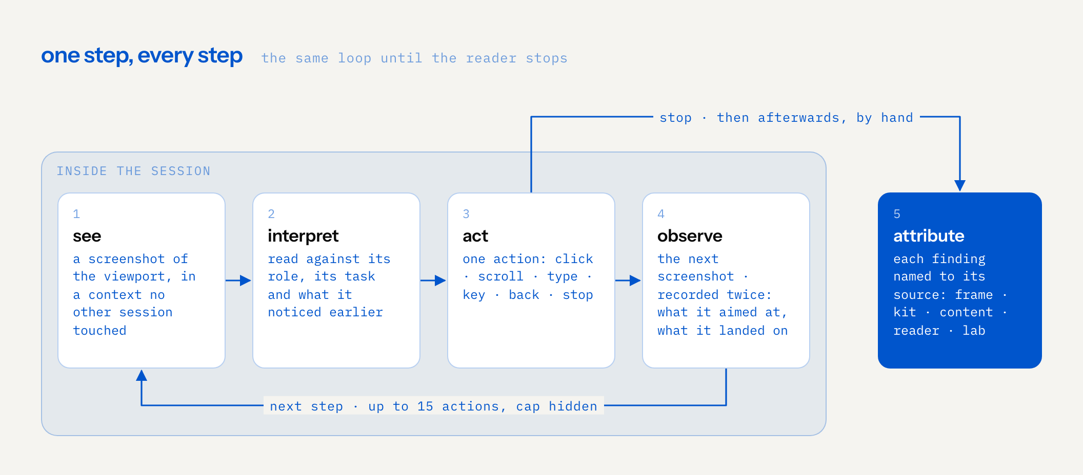
Every session is the same loop, run until the reader stops or hits the cap:
- See. A screenshot of the viewport, in a browser context no other session has touched.
- Interpret. The reader reads it against its role, its task and what it noticed on earlier steps.
- Act. One action: click, scroll, type, a key, back, or stop. Fifteen at most, and the reader isn't told there's a cap.
- Observe. The next screenshot. Every step is recorded twice: what the reader said it was aiming at, and what the click actually landed on.
- Attribute. Afterwards, each finding gets named to its source: the shared frame around the screen, the component kit, the content the producing model wrote, the reader itself, or the lab.
A reply looks like this, and nothing else:
{"observation": "what you see, in your own words",
 "target_seen": "what you're about to act on",
 "action": "click", "x": 0, "y": 0,
 "stop_reason": "", "answer": "", "confidence": ""}
Step five is the one people skip, and it matters most. A problem in the frame shows up in every screen that system will ever make. A problem in the content is one screen's problem. A misclick by the reader is noise. A limit of the lab is ours. They go to different fix lists, so who owns a finding is part of the result, not a footnote.
There's no judge and no rubric. We read every trace by hand, checked the final screenshots of every edit, and checked counts against the data. The friction is in what the reader did and what it said while doing it.
round one
Fourteen sessions: the thirteen planned cells plus the pilot, a repeat of one locate task. The operating part worked. All fourteen ended with a grounded answer, no tool errors, and in every edit step the click landed on the element the reader said it was aiming at, 12 of 12. Every reader understood the screen, located the late items, and recorded the slipped date. The trust task came back partial for all three.
The useful part was where they stopped. Six findings, ranked by how many readers hit them:
Two definitions of "behind". The status tiles said two items were behind target. The header over the list of late items said three. Five of seven readers on the understand and locate tasks stopped to point it out. One guessed the reason (the third item hadn't started, so it was past its date without being "behind target"). The screen never said so.
A date edit that saved in silence. Typing a new date applied at once: the day count, the note and the section header all updated. There was no save control and no confirmation. Four of four readers who made the edit finished unsure it had saved. The one at 1024 wide clicked somewhere else "to commit it".
"Assumed" read as stale. The screen carried a badge saying its as-at date was assumed. All three trust readers found it within one step, did the arithmetic against today's date, and concluded the page was a snapshot months out of date. That's a fair reading of a screen that says "tracking" over an old date. The date was a demonstration date, and nothing above the fold said so.
Status that ignored a moved date. After moving a late item a week out, the row still said behind target. Three of four readers remarked on it. Status may be right to stay put, since an owner sets it. The screen didn't say that, so readers expected it to change.
Tiles that looked like filters. One reader clicked a status tile expecting it to open the behind items. Nothing happened. None of the tiles were interactive.
Notes nobody reached. In fourteen sessions no reader scrolled far enough for the data notes at the foot of the page to come into view. Zero of fourteen. That's where the screen said the names were made up and the figures illustrative.
Two things that weren't defects are worth writing down. The list of late items did its job: every reader who made the edit clicked the row, jumped straight to the editable line in the plan, and was done in four steps. And the chat panel, a quarter of the screen's width, went unused. Zero uses in fourteen sessions. Every answer came from the summary and the list.
the fixes
Five of the six findings were the screen's own content, so they were fixed in the screen, within a day:
| finding | the change |
|---|---|
| Two definitions of "behind" | The header now says "3 late: 2 behind target, 1 past its date" |
| Silent save | The edit now confirms itself with "saved" |
| "Assumed" read as stale | The header now says, in the app's own metadata style, that it's a demo date |
| Status ignored a moved date | A note says the owner sets status |
| Tiles looked like filters | The tiles became a plain legend line |
The sixth, the notes nobody reached, isn't really the screen's fault. It comes from a rule in the system that generated it: on a product screen, the data story goes in the notes. We moved the date notice up into the header line for this screen and left the rule question for the people who own that system.
round two
Twenty-two sessions on the fixed build. The thirteen round-one cells ran again unchanged, same readers, same task wording, so the before and after measure the fix and nothing else. Eight new cells added three tasks that need more of the screen: what changed since the plan was approved, which actions fall after day 100, and find your own actions. Plus the pilot repeat. All twenty-two ended in a grounded answer.
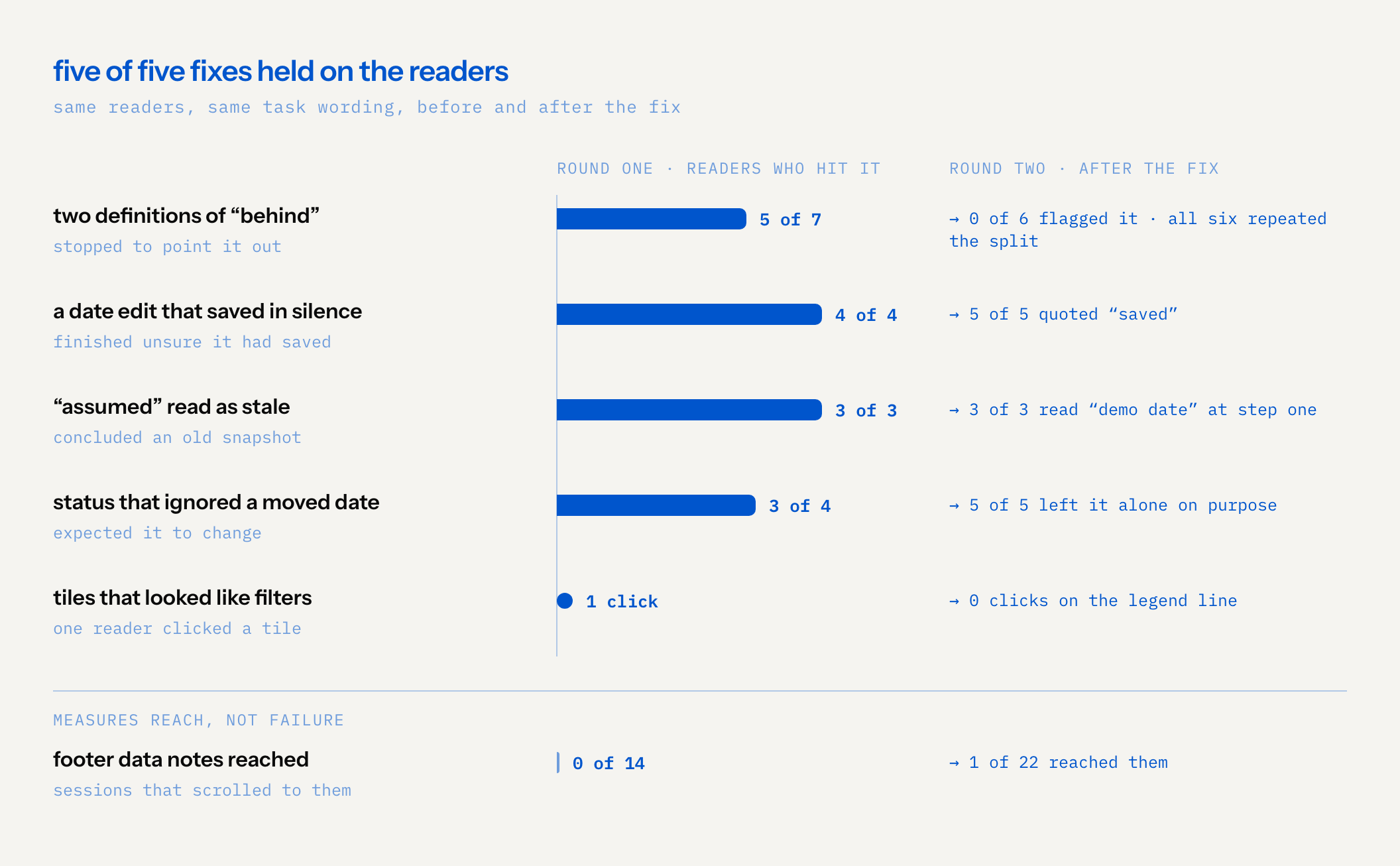
Every fix held on the readers:
- Two definitions: zero of six flagged a contradiction. All six repeated the split back correctly.
- Silent save: five of five quoted "saved" in their answer. Four said they were highly confident; one said "fairly sure", because it hadn't reloaded to check.
- Stale: three of three read "demo date" in the header at step one and said so. All three opened the note on how the dates were chosen, which nobody did in round one.
- Status: five of five read the owner-sets-status note and left status alone on purpose.
- Tiles: zero clicks on the legend.
- Notes: one of twenty-two reached them, at the end of a fourteen-step scroll. The date notice now works because it moved into the header. The line saying the names are made up still lives only in the notes, and no trust reader mentioned it.
Round two also found four new things, mostly because the new tasks went deeper into the screen:
- A late row that hid its status. An item that was both late and behind target showed only "3 days late", so a reader matching the header's "2 behind target" to rows had to guess which two. A wording fix.
- People with no route to their own actions. In the contacts view, some people showed how many actions they were responsible for. Team members whose group owned nothing directly had no such link, so a team member looking for their work found no way in there.
- A fold that opened below the fold. All three trust readers opened the note on the dates at the bottom of the viewport, then had to scroll to read it.
- No "my actions" route at all. The only filter was by responsible party, in a dropdown. The two readers sent to find their own actions couldn't use it, read every row of the plan by hand, in fourteen and fifteen steps, and both counts came out exactly right. One stopped on the last action it was allowed.
That dropdown is also where the lab hit its own limit. Native dropdown options don't render in a headless screenshot. Both readers clicked it, saw a focus ring and no list, tried the keyboard, and gave up. In a desktop browser the list opens. We named it as the lab's problem, not the screen's. It does make the missing "my actions" route visible, which is a real finding either way.
Two more observations. The chat got used the moment it matched a task: six of six readers on the two new tasks clicked the matching suggested question within two steps, after first noting that they couldn't see the answer on the page. Four of the six added a caveat on their own, that the answer came from the chat and they hadn't checked it against the plan. And across thirty-six sessions, nobody clicked the navigation sidebar or anything else in the surrounding frame.
results
| hypothesis | verdict after two rounds |
|---|---|
| 1. Operate through screenshots | Supported. 36 of 36 sessions ended in a grounded answer, including fifteen-step sessions with exact counts |
| 2. Friction without critique | Supported. Every finding came out of task answers and confidence notes, with a step and a screenshot behind it |
| 3. Readers behave differently | Only on tasks that were personal to them. On every shared task the three paths were identical, and only the wording of the answer changed |
| 4. Readers can tell what's real | The date part is fixed. The made-up-names part is untested, because no task leads to the notes yet |
The attribution was useful in itself. Of ten findings, nine were the screen's own content and one was a rule in the system that generated it. None were the frame or the component kit. One more was the lab's limit, filed as such. That's a fix list with clear owners, which is more than "the page felt confusing" gives you.
The method numbers are the other result. Thirty-six sessions over two rounds cost $2.94. Round one was fourteen sessions for $0.62. Round two was twenty-two for $2.32, and the two find-your-own-actions sessions were $1.12 of that on their own. A typical session ran 11 to 70 seconds and cost 3 to 9 cents. Round one took under fifteen minutes of wall clock, smoke runs included; round two's batch took about twenty-two. At that price it can run on every build.
what this is not
Synthetic evidence is not human evidence. We want to be plain about the limits.
- An agent reading a screenshot isn't a person reading a screen. It doesn't reproduce human attention, patience or the moment someone gives up and closes the tab. It can tell us where a screen is ambiguous. It can't tell us how much that costs a real person.
- The personas mostly didn't matter. Three different roles took the same path on every shared task, the same two clicks at the same coordinates. They diverged only when the task was personal to them. Either our persona notes are too weak, or a screen that answers most tasks from the first viewport leaves no room to diverge. We don't know which yet.
- There's no human anchor yet. Real people saw this screen too. Their reactions haven't been written down, so we can't yet score the 36 answers against what humans actually did. Until we do, we don't know how often the readers find what people find, or what they miss. It's the missing denominator.
- The reader knows today's date. A colleague opening the link knows it too, so it's realistic. But it means the trust results depend on when the test runs relative to the screen's as-at date.
- The lab has blind spots of its own. Native dropdowns don't render in headless screenshots. The smallest model we tried clicked about 4 percent short of its target, because it sees a scaled copy of the screenshot, so we left it out until the driver corrects for that. Both are lab findings, filed against the lab.
- One screen, one model family, two rounds. The readers are Claude models, the same family that made the screen. That's partly a data decision, since the material stays inside tools the company has already cleared. It also means the readers may share the producer's blind spots.
So this is early screening and regression testing, not a usability verdict. It's cheap enough to run on every build, and good at telling you that a fix held. It doesn't replace watching a person.
what we'd test next
- Anchor it. Write down what the real people did and score the readers' answers against it. That's the only way to know how far this can be trusted.
- Give the lab a dropdown action. Let the reader say "choose this option" by its visible text, so native selects stop being a dead end. Raise the cap to twenty for tasks that mean reading a whole table.
- A trust task that leads to the notes. "Are these the real people and names?" would test the one line no reader has seen, and the generator rule behind it.
- Tasks that only one view can answer. A task that's answerable only from the timeline would tell us whether readers find a view they have no reason to open.
- More screens. Run the same loop over a wider set the same system produced, and see whether the frame and the kit stay clean once the screens get stranger.
The same thing we said last time holds here too: synthetic users find the bugs, and real users find out if they matter. This lab only moves the first part somewhere new, from what an AI says to whether you can use what it made.